The Paragraph

Research…

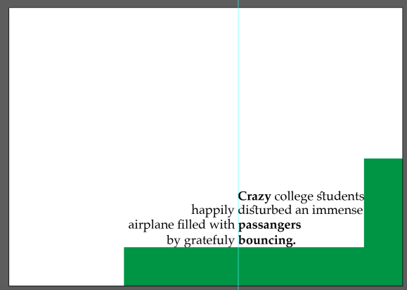
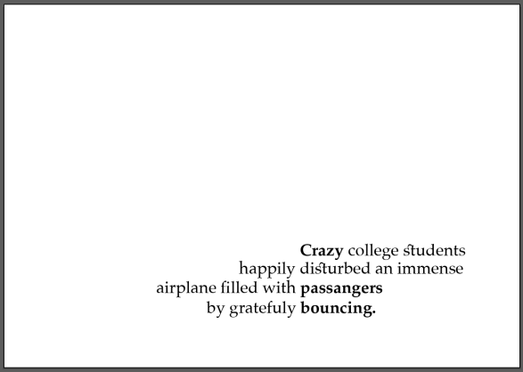
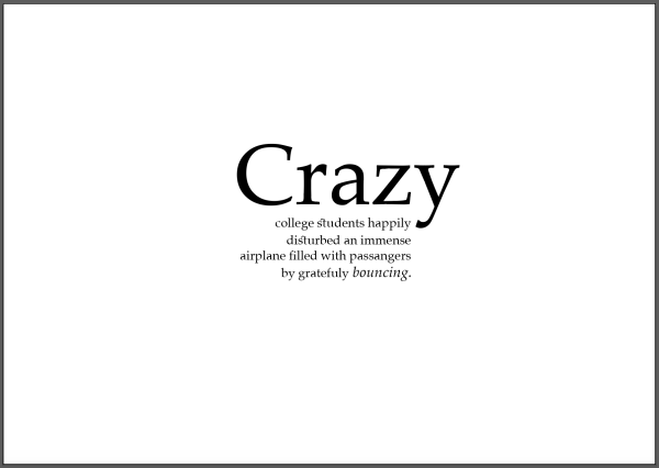
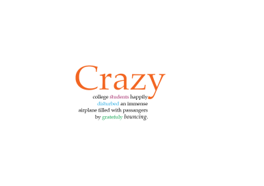
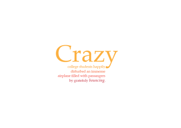
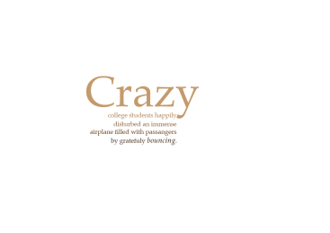
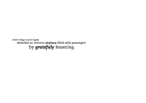
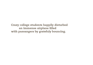
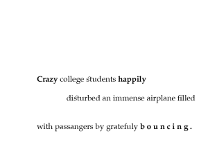
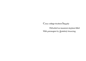
Placing text on a page is something that we do almost everyday on social media. Its because when you place text on a blank page or on a image in a specific order it creates an attachment for viewers to want to read it makes text more interesting to read. Thats why text today uses a poetic system to play with text, size, colour and the placement of text on the page to get people to read text more as an image then reading it from a book.
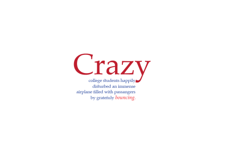
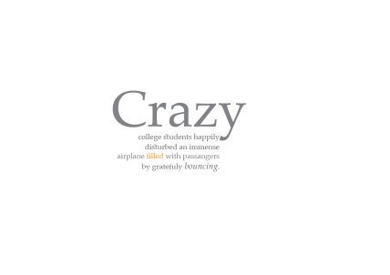
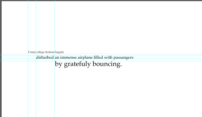
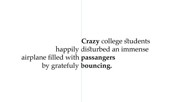
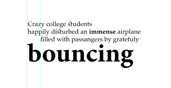
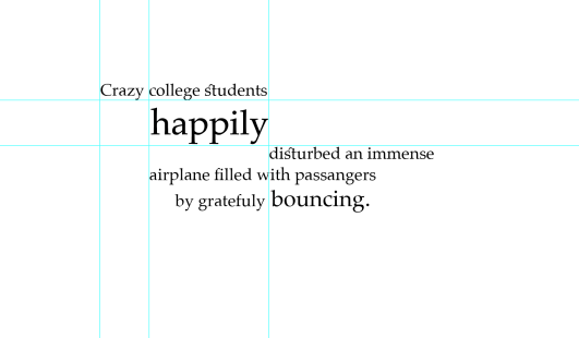
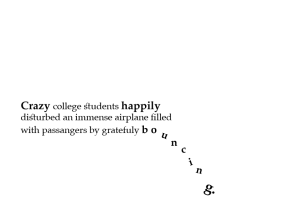
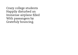
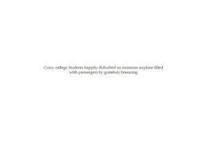
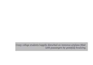
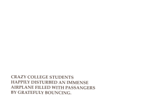
 

My paragraph

The paragraph is about happiness the opposite meaning of my word, dismal. I took this paprgraph from a book by Michael Argyl. I feel more confident in this project because i know the rules now of how to make type pleasing to the eye, now what i have to do after understanding it is create a system that works for me.

screen-shot-2016-11-20-at-9-58-12-pm

screen-shot-2016-11-20-at-9-58-30-pm

The Intent

Simplicity…

During this project I discovered that i work best under pressure  for some reason. I got a chance to play with photoshop, which is something i struggled a lot with, i never got the hang of i always felt that illustrator is better, but after the work shop with tareq i got more comfortable and discovered several new features and techniques that photoshop even had. i found it easier to draw with the pen tool then in illustrator.


Concrete 

To be completely honest I got this idea from the comic scene of batman slapping robin. First  I drew the female with the niqab (covering the face), meaning that  even women that cover their face get harassed by men, when they are clearly not interested. In this sign the male is trying to give his number but gets denied by a slap the card his holding is his phone number and there are 8 to show the right amount of number in an actual phone number.

final-5-01

Abstract

final-5-02

Local

final-5-06

Vernacular 

final-5-04

Global 

final-5-03

Behind the scenes…

img_0321

img_0307

img_0290

Saying No!

When creating signs the first thing that came up to mind was traffic signs so when ever we were designing it we would referenceing  to traffic signs of it being flat. So these are a couple of different styles of a No flirting sign. Saying no without using the red sign made my design more interesting because at first i was thinking of placing a male and female then a red line across the hole thing. But when we were restricted of not using it, it made me think deeper of ways of saying no and it just made it more interesting to just to look at but as well as when designing it, its just historical.

screen-shot-2016-11-09-at-11-46-26-am

In Doha (especially) flirting is a common thing, to harass girls by simply just throwing words at her when they pass by, so this idea made me want to create awareness that not everyone is interested in your words or number. So my target audience are male Qatari well it happens everywhere in the middle east but for now I’m aiming at Qatar  from the age of 20 and 35. This sign would be placed in malls and popular restaurants  such as in katara and the pearl of Qatar.

screen-shot-2016-11-09-at-11-46-30-am

C O L O U R !

I chose this composition because it is more pleasing to the eye and is thoughtfully tracked and aligned the sentence to the right so breaking the ice of the traditional way of latin being aligned on the left. I enlarged the first word of the sentence  so it made it appear interesting when seen from distance makes you want to read the smaller writing. What made it intresting too is when I aligned the first sentence with the end to the ‘ Y ‘ so as if its a puzzle and connected together perfectly, other words it blended in nicely as an overall layout of my composition.

a3-01

a3-02

a3-03

a3-04

a3-05

TRAKERNING

Working with indesign that i strongly dislike, because i feel its controlling my design instead me controlling it, where in illustrator i feel more freely and in control !

so indesign, kering tracking copying pasting 50 times, not bad. i discovered that now everything works well with all typefaces some work better then others regarding size and tracking. Observing the different options really made me see what works and what doesn’t and how to use it and when to use it.

JANNA

janna janna5

PLATINO

palatino palatino5


FINAL PRODUCTION

The concept was identifying  unknown cities in Qatar and Australia and creating the main icon that is known for these cities.

imaginin-postcards-copy-01

My vision was placing all these main icons onto one postcards so it was like a collage, and i added a scrambled up paper as the sky to give more texture and 3D effects to the illustrations. But it was too forced and theres was a lot of things going on that it didn’t work, so decided to separate each icon on its own postcard.

img_9421

Along the way i found it interesting to have only the outlines of the illustration and with some parts coloured in, then i came up with the idea of having to target audience adults and children, so postcards fully coloured and designed for adults  and the outlined of the icons for children to colour in.

a2-final

I designed the hole layout of how it would be so no borders and simple layout for the writing on back with my name and website.

screen-shot-2016-10-23-at-2-42-14-pm

Laying out everything measuring all the spaces between the illustrations to make it into a poster.

img_9733

The process of printing was quite simple but because there was a waiting list it took a lot of waiting to do. but it turned out better then i thought and the colours were perfect on the mat paper. As an overall i really enjoyed this project, i am now a pro at drawing landscapes and copying images. The process of designing was a lot when i thought it would be simple and easy but it really wasn’t there was always little changes to make and how some techniques worked and some did not.

COLOR

Adding colour was a huge decision that we had to make as a group, because we all had different ideas that we wanted to do with colour and we all wanted a different colour. . . .  .

img_9424

The colour dripping was supposed to be blue to repent water dripping through the shapes, but someone else wanted yellow, so what we did was mixed blue and yellow and made green so that everyone is happy and pleased.

Working in a group was hard, because trying to come up with something that everyone agrees on took time and effort to try to convince them why this works better than that. As a final outcome to the mural i think we did a great job.

img_9530